Changelog - March 25 through April 2
With the Enterprise release behind us, we're back to shipping features!

As we approach the Enterprise release, we're focusing on bugfixes and small improvements.
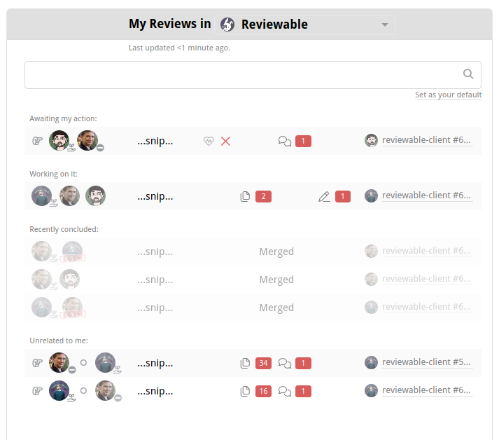
Dashboard Changes
We've heard a lot of feedback about the avatars and icons used in the dashboard, and we made quite a few changes this week:
- Statuses now show in the bottom-right corner of most participant avatars, so you can quickly see who's being blocked on and why.
- The PR author is now next to the branch name, as that relationship is more direct, and provides a quick way to discern who the author of that PR is. You can still filter based on an author's name or username if you want to narrow it down quickly.
- The separator for active/idle participants is no longer the pause icon, now it's a small circle.
- Idle participants are now faded out.
The result of the above is that the dashboard now has a more consistent feel that should be more easily visually parsed. Please give us feedback on the new format as we would love to keep improving it!
Code Review Experience
Nobody likes reviewing generated code, right?
Well, in Reviewable you always can review it, but now we more reliably show it as generated (see the docs on what we consider generated). As a reminder, we support .gitattributes for enabling/disabling/modifying diffs for various files.
Status checks repeat status checks names often, repetitively
A long time ago we noticed, and fixed, the problem where status checks' names and their statuses tend to repeat, so we elide the name when it's repetitive. However, we were a little overzealous and elided it even when the name was somewhere in the middle of the status, which is hard to read and can be inconsistent depending on the check.
So now, we only elide the name when the status starts with the name!
Unreplied discussions can run, but now they can't hide
There was an edge case possible where a discussion that was previously replied-to, becomes considered unreplied-to, that it would still be hidden in the "gutter" with the other replied-to discussions. Now, if you mark a comment as unreplied, such as through our "Trust but verify" mode, then it won't disappear.
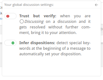
Note: we also fixed a bug where turning that mode off while on a discussion that's only visible because that mode is on, won't cause a crash. If that didn't make sense to you, I'm sorry, just trust me we fixed a bug.
To the dashboard, Batman!
When you reach the bottom of a review and leave a comment, often you want to go back to the dashboard. You can usually hit the browser back button, or alt-left, but we added a link to make you mouse users happy, too. Thanks to @nneul for the feature request!
Mobile Code Review
Android + GitHub app coexistence
We fixed an issue that would make logging in not work when you had the GitHub app installed. Now you can log in and get code reviews done on the train (you better not be reviewing-and-driving!)
Code Authoring Experience
Making small changes through GitHub's editor

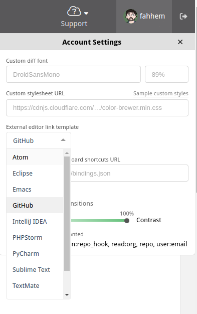
When you hover over the top of a comment, you'll see 3 links: a GitHub icon, a copy icon, and an editor icon. The GitHub icon takes you to the file and line in GitHub's UI, while the copy icon puts the file:line into your clipboard (for pasting into command lines or other tools). The editor icon lets you open the file (at that line) in your selected editor, which you can configure in your account settings in the top-right corner of the window:
This feature was introduced in last week's changelog, but we fixed a couple issues with it this time. Specifically, we made it handle GitHub Enterprise deployments by specifying the correct URL, and we also open the editor to the correct line, as we do all other editors.
Miscellaneous bugfixes and improvements
The section every user dreads is nigh!
But don't worry, we feel you, we get you, we know that feel, dawg. So let's get through this together.
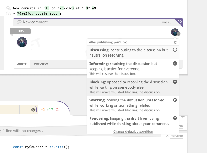
- Fixed an edge case where file headers would block the bottom 2 dispositions in the list.
Improved the in-product documentation of the
"Approve" button outputsetting. This can be found in the settings for a given repository, in the Repositories page.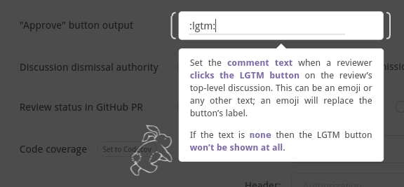
Handling invalid Markdown better in comments and PR descriptions. GitHub sometimes fails to render Markdown, so we added a fallback that shows the original text instead of a blank block.
Fixed the
body.textdata in the webhook missing a couple trailing characters.Added the
review.statusfield that reproduces the review's status (as defined by the completion condition), such as "2 of 3 files reviewed, 2 unresolved discussions", to the webhook payload.Fixed some Sentry error tracking to be less noisy (only relevant for us and Enterprise users with Sentry enabled.)