Introducing the long-awaited sidebar.


At some point, every large code review starts to present the same problems.
You scroll to the code you need to review. Then you need a bit of context from somewhere else. You lose your place. Now you’re trying to scroll your way back to that exact line or discussion again. This breaks your focus and makes code reviews take substantially longer than necessary.
And of course, the bigger the review, the worse this gets.
So we built the sidebar!
Code reviews in Reviewable now include a flexible sidebar that lets you navigate reviews much more efficiently. We've also introduced a powerful Discussion matrix that sits next to the File matrix in the sidebar for easily locating discussion threads.
For a while now, it's been obvious that the sidebar is the optimal design for in-review navigation, but the journey has been a long one. Today, we're proud to finally release the evolution of the Reviewable user interface.
Buckle up, because we've packed a lot of great features into this one!
How the sidebar improves your review experience
The flexibility of the sidebar allows you to quickly navigate reviews in a way that suits your device, window size, and, of course, your horizontal space preferences.
Navigation
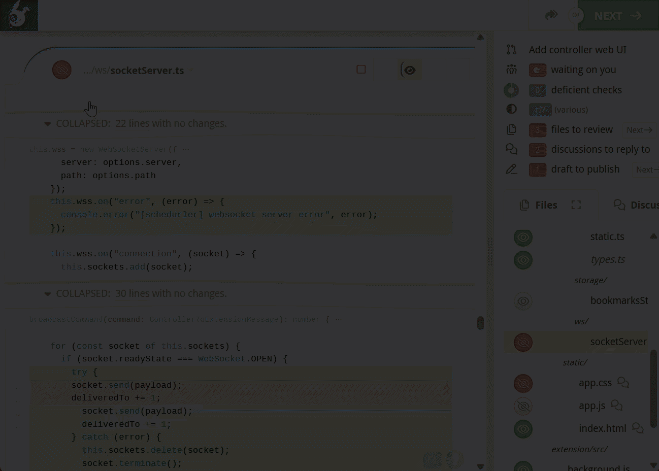
We moved the review icons out of the status bar at the top of the page and into the new sidebar on the right. This leaves a lot more space in the status bar for reviews that end up with lots of revisions.
On the old status bar, revision cells would be hidden by the information panel icons when viewing files with lots of revisions. 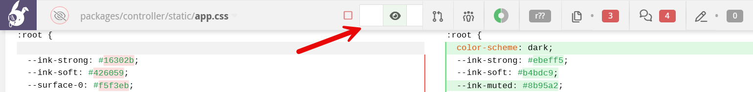
With those icons out of the way, there's more room for revision cells to get comfy.
Additionally, there's now a Next button to take you to the next item needing your attention.

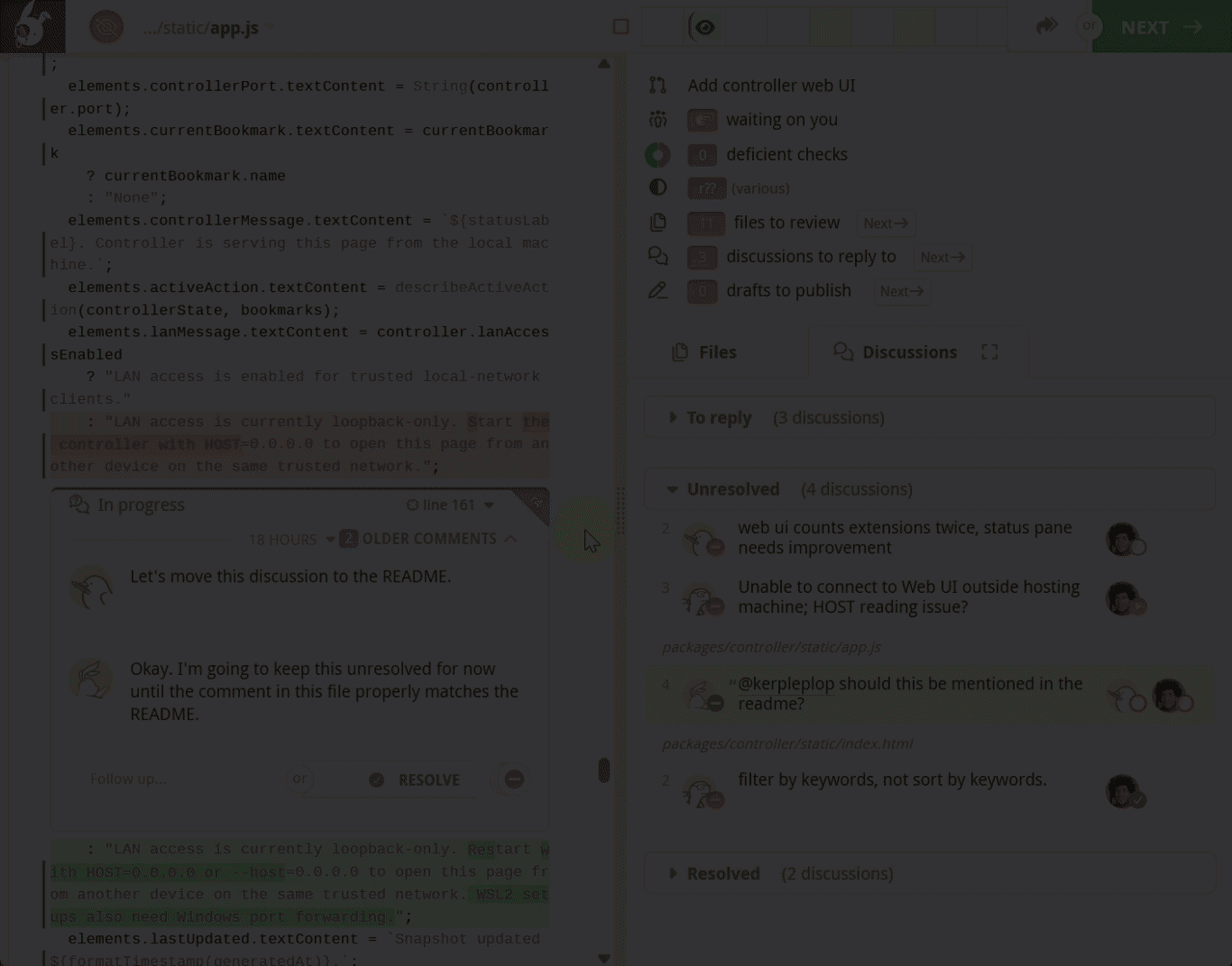
Most importantly, the file matrix, along with the new discussion matrix, are now ever-present in the sidebar. This change allows you to quickly navigate to any file or discussion with a single click. No more back-and-forth scrolling required.
Scroll the file or discussion matrix left and right (shift+scroll), or open them in full-screen for a better view.
Screen real estate
Everyone likes the idea of a sidebar until it steals screen real estate vital to keeping your diffs in side-by-side mode. For many of our users (including us on the Reviewable team) maintaining screen space is non-negotiable.
So we made sure that the sidebar does not interfere with your layout by giving you a handful of different layout options, ranging from fully expanded mode to completely-out-of-the-way mode.
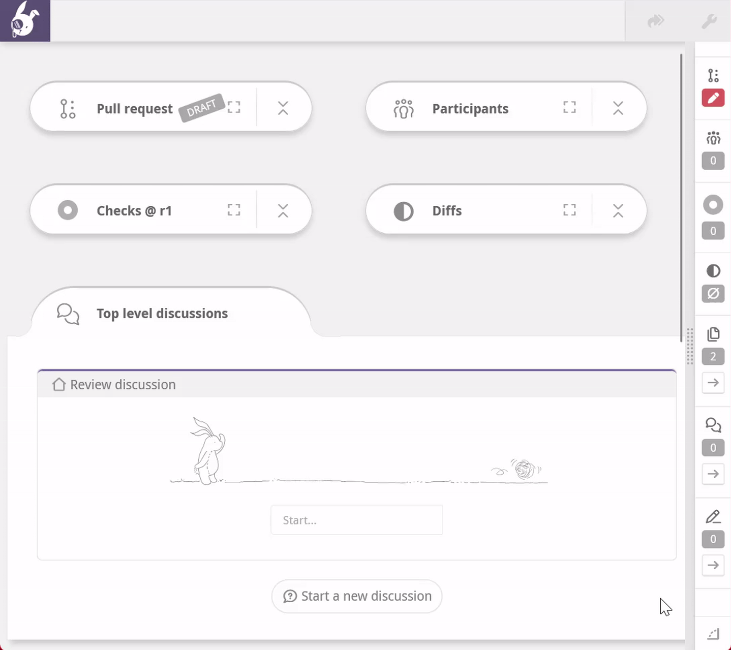
Full mode
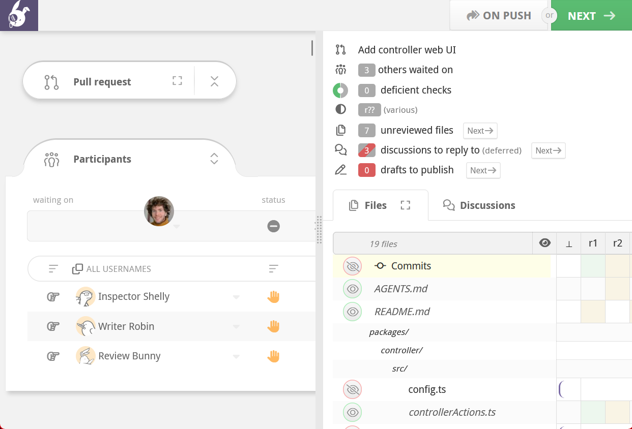
This is the default sidebar mode. Isn't it beautiful? It's resizable, so you can have it take up as much space as you would like. This is the most useful sidebar mode because you can see the entire file matrix and discussion matrix, as well as summaries of each review information panel.
Double click the drag gutter to quickly dock/restore the sidebar.
Docked modes (vertical and horizontal)
If the full sidebar takes up too much space but you still want the handy navigation buttons, you can dock the sidebar to the side or the bottom of the screen.
Clicking the button pivots between these two modes.
Collapsed mode (get-it-out-of-my-way-mode)
Don't want the sidebar at all? Or want it only on-demand? We've got you there too.

In collapsed mode, you can shrink the entire sidebar down to a single button in the bottom right-hand corner of the page. Clicking the button will extend the sidebar across the bottom of the window so you can use the navigation icons, then collapse out of sight.
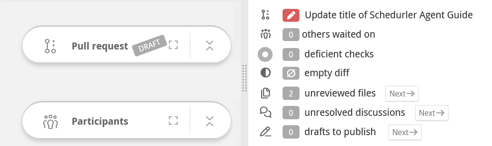
Review info panel links
As a part of our path toward the code review sidebar, we've converted the info sections ( Pull Requests, Participants, ![]() Checks, Diffs, and the Conclusions panel) into collapsible panels.
Checks, Diffs, and the Conclusions panel) into collapsible panels.
When you click an information panel link while the panel is collapsed, it opens in a full-window modal so you don't lose your scroll position. If the panel is expanded, the review page gets scrolled to the open panel.
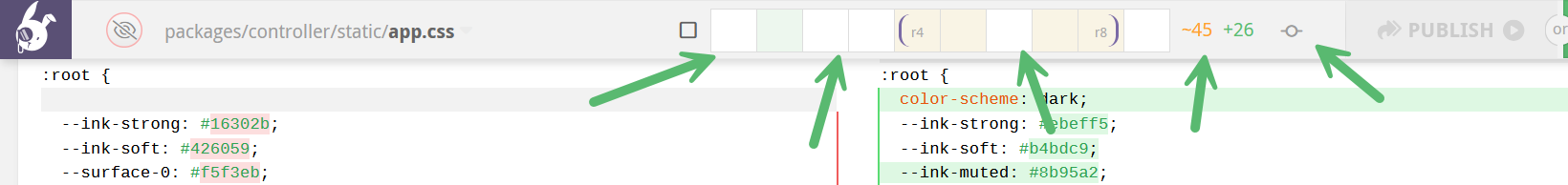
Some of these items, namely files, discussions, and drafts, now contain next buttons that let you rapidly scroll the page to the next file, discussion, or draft.
Crank it into reverse: hold down the
shiftkey to cycle thepreviousitems in each list. Weeeeee!
Lower cognitive overhead
Faster and more precise navigation means faster code reviews and higher productivity.
You no longer have to worry about losing your place in the code in order to get more review context, like seeing the state of the pull request, investigating some failed checks, or cracking open the File Matrix to see who has reviewed what.
The result? Less mental juggling and scrolling-whiplash that comes from constantly reorienting yourself, letting you stay focused on the review instead of your scroll wheel.
Making the most of the Sidebar
Here are a few quick tips that can help you get the most out of the new sidebar and keep your review momentum going strong.
Per-screen preferences are remembered
As users of Reviewable ourselves, we wanted the sidebar to "just work" on various monitors. So we designed the sidebar to remember its settings for any new screen you use, as long as you explicitly adjust the sidebar state on that screen.
Using hotkeys
Check out the new custom keybindings we introduced for the sidebar. This lets you assign any shortcut you want to quickly toggle a sidebar state (e.g. docked on the bottom of the screen -> collapsed) without leaving the keyboard.
Using the Discussion Matrix
The Discussion matrix surfaces and organizes every discussion, providing a bird's-eye view to help you navigate extra chatty reviews.
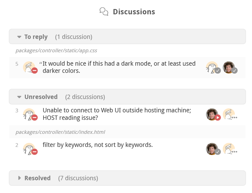
Just like the File matrix lets you comprehend the state of all files in the review, the Discussion matrix gives you a clear overview of every discussion. It shows which threads need replies, which are resolved or unresolved, and which will be resolved after you smash that publish button. You can also see the dispositions of everyone involved, all in one place.
Discussion summarization
The Discussion Matrix leverages Google Gemini Nano models that are built into the latest browser versions, providing locally-generated discussion summaries for quickly comprehending discussions at a glance.
Discussion summaries can only be generated by browsers that support built-in AI such as Chrome. Once generated, they are shown to all reviewers regardless of browser support.
We hope these changes make your code reviews smoother and more reliable. Try it out and let us know how it’s working for you—we’d love your feedback or chat with us directly.