
Repainting our app mid-flight
Lessons learned from overhauling an aging CSS framework

Review code with protected eyes 😎
Reviewing code can be a strenuous activity for your eyes, but it doesn’t have to be. Recently, we launched dark mode on Reviewable. The default setting is system, so you can use your OS settings to control Reviewable's theme dynamically, or, if you are like me, set it to permanent dark mode.
Dark mode in Reviewable has been one of our most requested features for a while now. Despite the pressure from our users, the task was not a small undertaking and some significant obstacles stood in the way.
Reviewable has been in the code review game long enough that our UI framework was in need of some modernizing and it took overhauling certain parts of our codebase to make dark mode happen. To our credit, at least we beat Wikipedia to it and they’ve been around since 2001.
Need to rein in the growing number of colors used in your application? Read on for an overview of our approach to a large-scale UI overhaul with a deeply entrenched CSS framework.
TL;DR Narrow down the total quantity of colors in your app using colorguard. Define a well-designed color palette and stick to it. Leverage modern CSS like
--*(custom properties),color-mix, andhsl(or other modern color syntax). Choose your CSS framework wisely - it will be with you a long time!
Getting to dark
Reviewable is a well-established application, 10+ years in the making. When you consider the ever-quickening pace of modern web development, you can consider yourself lucky if the tools and frameworks you use today aren’t "legacy" in 2 years, let alone 10.
Our CSS framework, Semantic UI, is one such legacy piece of software for us. And it touches nearly every part of the UI!
Reviewable uses a forked version of a pre-1.0 Semantic UI release. While more modern versions of Semantic UI provide less variable theming, this legacy version doesn’t have theming of any sort, let alone CSS custom properties.
Since CSS variables make for an excellent theming mechanism, and since we had already built a nice collection of variables to use in Reviewable, this became our first challenge. We want to use --*!
Developing a plan
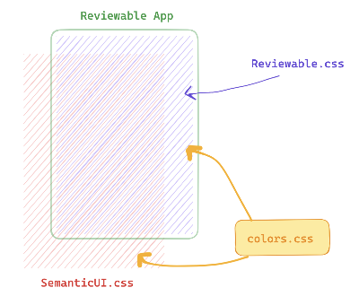
We knew that our special version of Semantic UI needed to be themeable. But we also wanted a design that let us control the entire app's theme with a single "Reviewable"-owned set of variables (in colors.css).
This is because we have a lot of custom styling layered on top of Semantic styles to give it that special Reviewable aesthetic you know and love.
Our Reviewable palette variables should apply to all of Reviewable and the new Semantic UI theme so that the app has 100% style coverage without fighting against Semantic the whole way.
This was the plan:
- Modernize our Semantic fork to be themeable.
- Build a Reviewable palette (a set of CSS variables) and update Reviewable and Semantic UI to use the palette.
- Build the dark theme version of the palette.
Modernizing our CSS infrastructure
One way that Semantic UI makes its graphical elements shine is by using a very large number of color shades. This looks great, but is pretty inefficient when it comes to themability. Managing hundreds of custom properties just for color was going to become quite a chore.
Downsampling the Semantic palette
So once we had replaced all hardcoded color shades in Semantic with --sui-* variables, our next task was slimming that number down. The result would be a lofi variant of the palette that would allow us to control the colors in Semantic elements with our Reviewable palette variables. The lofi variables map to the greater set of --sui-* variables.
We shrink the interface by mapping a single lofi variable to multiple shades where we can get away with it. The minimum set of Semantic lofi colors was important to consider because the Reviewable palette could never be smaller than this set of colors.
Colorguard to the rescue
This task was accomplished with the help of colorguard which leverages the CIEDE2000 algorithm for determining how close colors are and if they are within a threshold of human perception.
The International Commission on Illumination
shed some light ondeveloped this formula in the early 2000s and it has been the standard for solving this particular problem across many industries.
Application of the algorithm helped us determine which individual colors could be lumped into a single color variable without a major loss in fidelity to the existing Semantic UI aesthetic.
The result of this process was a step down from 139 individual colors to 42. Much more manageable!
Remember, this work was limited to the forked version of Semantic itself. We hadn’t done any app-level styling yet.
Defining the Reviewable palette
Reviewable's palette was largely adapted from Semantic. So a similar process was used to purge the app of unnecessary shades. We iteratively replaced app colors with shades that were imperceptibly different and worked our way towards the core set of colors that define the Reviewable UI.
The palette looks something like this:
:root {
/* Black Colors */
--black-1: hsl(var(--fg-base-hsl));
--black-2: hsl(0deg, 0%, 20%);
--black-3: hsl(0deg, 0%, 25%);
/* Grey Colors */
--grey-1: hsl(270deg, 1.12%, 34.9%);
--grey-2: hsl(0deg, 0%, 40%);
--grey-3: hsl(0deg, 0%, 50.2%);
--grey-4: hsl(0deg, 0%, 59%);
--grey-5: hsl(0deg, 0%, 66.67%);
--grey-6: hsl(0deg, 0%, 79.61%);
--grey-7: hsl(0deg, 0%, 86.67%);
--grey-8: hsl(0deg, 0%, 90.98%);
/* White Colors */
--white-1: hsl(0deg, 0%, 94.9%);
--white-2: hsl(0deg, 0%, 97.25%);
--white-3: hsl(240deg, 11.11%, 98.24%);
--white-4: hsl(var(--bg-base-hsl));
/* More colors... */
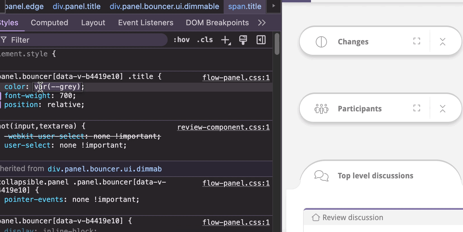
}We use hsl for a couple of reasons. It's much easier to build an intuition of what a color should be from hue, saturation, and lightness than an arbitrary-feeling hex string or even rgb notation.
This also lets us order the colors in the palette in a sensible way - by lightness value. Now we have a logical ordering and picking a color in devtools is a breeze. Start typing the color you want then cycle through the variables to pick a shade. A nice DX if I ever saw one!
Finally, we use this palette to override our lofi variables in the same colors.css file.
  --sui-lofi-white-d-1: var(--white-2);
  --sui-lofi-white-l-1: var(--white-4);

  --sui-lofi-black-d-1: var(--black-1);
  --sui-lofi-black-l-1: var(--black-2);

  --sui-lofi-grey-d-1: var(--grey-1);
  --sui-lofi-grey-d-2: var(--grey-3);

  /* and so on */
Leveraging modern CSS features
By defining --bg-base-hsl (background) and --fg-base-hsl (foreground) like this:
  --bg-base-hsl: 0, 0%, 100%;
  --fg-base-hsl: 0, 0%, 0%;
We set ourselves up to use color-mix as a progressive enhancement and can generate the palette from these building blocks.
  --black-1: color-mix(in srgb, hsl(var(--fg-base-hsl)), hsl(var(--bg-base-hsl)) 0%);
  --black-2: color-mix(in srgb, hsl(var(--fg-base-hsl)), hsl(var(--bg-base-hsl)) 20%);
  --black-3: color-mix(in srgb, hsl(var(--fg-base-hsl)), hsl(var(--bg-base-hsl)) 25%);

  --grey-1: color-mix(in srgb, hsl(var(--fg-base-hsl)), hsl(var(--bg-base-hsl)) 34.9%);
  /* ... */
  --grey-8: color-mix(in srgb, hsl(var(--fg-base-hsl)), hsl(var(--bg-base-hsl)) 90.98%);

  --white-1: color-mix(in srgb, hsl(var(--fg-base-hsl)), hsl(var(--bg-base-hsl)) 94.9%);
  --white-2: color-mix(in srgb, hsl(var(--fg-base-hsl)), hsl(var(--bg-base-hsl)) 97.25%);
  --white-3: color-mix(in srgb, hsl(var(--fg-base-hsl)), hsl(var(--bg-base-hsl)) 98.24%);
  --white-4: color-mix(in srgb, hsl(var(--fg-base-hsl)), hsl(var(--bg-base-hsl)) 100%);
This allows us to get a crude dark mode going by swapping only these two custom properties:
- --bg-base-hsl: 0, 0%, 100%;
+ --bg-base-hsl: 0, 0%, 0%;
- --fg-base-hsl: 0, 0%, 0%;
+ --fg-base-hsl: 0, 0%, 100%;
This isn't the dark mode you have now (we'll get there in a moment), but it's what got us 80% of the way there rather fast once the groundwork was laid.
Keeping color creep at bay
Defining a set palette is an excellent way to keep the number of colors in your app from creeping towards infinity over time.
If you are designing a very green new feature and you have a palette, then you already have preset shades of green to choose from so you won't go searching for the nearest green element and copy over its hex value. Or worse, select a value at random!
Adding colors to your palette over time is acceptable and your core palette should be designed to be adaptable to your changing needs. Since we have incorporated our palette ~a year ago, though, we haven't had to add a single color. YMMV if you are starting with a younger palette. Ours was quite mature by the time we converted it to an actual color system.
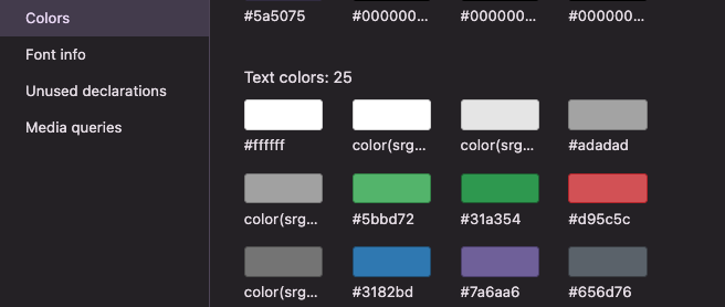
Did you know that you can see how many shades your app has on page with Chrome Devtools CSS Overview?
Building the dark theme
At this point, we could finally write the actual dark theme!
The nature of code review tools is to present lots of information to the user. So Reviewable is a pretty involved UI as far as they go.
This means that components like the File Matrix end up being challenges to re-style for a dark theme since not all UI elements translate 1:1 with a desaturated version of the light mode UI. This is especially true with elements that have a lot of layers and color.
While our color-mix inversion technique got us 80% of the way there, we didn’t want to end up with a UI that was simply swapped dark and light backgrounds and text. The approach we took at this point was to systematically design and apply the dark palette to each aspect of the UI one at a time (the Semantic components were already properly shaded!). This ensured that the end result was meaningful and no utility got lost in the process.
Takeaways
It's far too easy for the number of colors in your application to get out of control over time. There are a few ways we used to mitigate that and rein it in though not without a bit of sweat involved. We established a designated set of CSS custom properties that represent the Reviewable color palette and make sure to use only those colors in the app.
We incorporate techniques like colorguard to reduce unneeded color shades based on whether or not humans are likely to perceive differences in those shades. "Use modern CSS features" is an obvious statement, and at times easier said than done, but is well worth the effort. Features like color-mix, --*, hsl, and native CSS nesting allow you to maximize what you can express with a pretty minimal amount of work.
Down to hack your own custom reviewable theme? Take a peek at our palette in your browser devtools and go generate your own custom stylesheet with experiments.reviewable.io with your overrides on
:root.